

Background
A brand is the promise of a differentiated and valued experience. From the brand core to the rollout of the brand design program at OCAD, I have developed a hypothetical socially and/or environmentally aware organizational brand.
After brand and service development using the given topic "Instant Houses" by the instructor, I designed elements of logo, colour, and type, as well as their application in two-dimensional media. The verbal voice of the brand core, envisioned future, brand essence, and brand personality were developed and integrated into the final presentation materials.
Team structure
This project was done by myself, guided by Professor Kathleen Parle. We (students) had weekly group critiques to present and discuss our design process.
My Roles & Responsibilities
I developed the direction and purpose the company offering instant houses for disaster recovery (Safe Home). Later I created strategic planning to develop services and products for the company, research on the market, design and develop the brand.
Research and Development
Effective brand development is dependent upon research and a comprehensive understanding of the client, the competitive marketplace, and consumer values and needs. Differentiation, positioning, voice, and design serve to make a brand unique and unforgettable. Here are some of the process of my work:
Brand foundation
Target Market
QuickNest®’s target market is not limited by geographic boundaries; rather, it encompasses anyone, anywhere in the world, who requires immediate, reliable, and innovative housing solutions in the face of unexpected disasters. The company’s global reach ensures that its support extends to a wide array of communities and individuals in need, embodying its commitment to providing hope and practicality in times of crisis.

Demographic: Families, including children, adults, and the elderly, affected by disasters such as wildfires, earthquakes, floods, hurricanes, and other natural or man-made calamities.
Geographic: QuickNest™ caters to families globally, irrespective of their location, who have lost their homes due to unforeseen disasters.

Demographic: Non-governmental organizations, aid agencies, and humanitarian groups working to provide emergency relief and rehabilitation to affected communities.
Geographic: Collaborating with renowned organizations such as the United Nations, QuickNest™ offers its expertise and products to support their global humanitarian efforts.

Demographic: Individuals who have been displaced from their homes due to disasters and require immediate shelter solutions.
Geographic: QuickNest™ provides support to both urban and rural areas across the world, ensuring that displaced individuals receive timely assistance.

Demographic: Local and national government agencies involved in disaster response and recovery efforts.
Geographic: QuickNest™ collaborates with government agencies worldwide, providing them with instant housing solutions to aid in their disaster recovery initiatives.

Demographic: Communities residing in areas prone to recurring disasters, such as coastal regions prone to hurricanes or earthquake-prone zones.
Geographic: QuickNest™ offers proactive solutions to communities in vulnerable areas, enabling them to prepare for potential disasters and have access to swift housing solutions when needed.
Brand Personality

Brand Essence

Competitors
NESTRON | BOXABL | ESCAPE HOMES
Name Generation

Branding Design
Logo Design


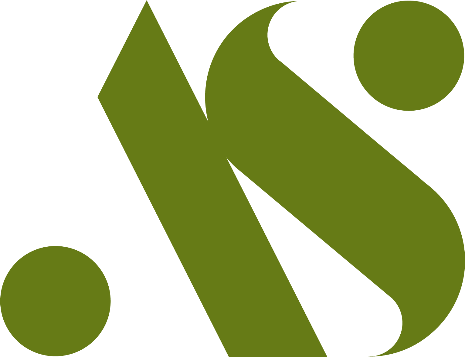
The icon represents the company’s purpose and how we provide shelter for those in need. The icon is the central part of the primary logo, and the company must be asked for permission for the use of any other variations without the icon.


Here are the two main variations of the logo. The original can be used in a composition with a light background, and the reverse would be a better choice for a dark background.
Maintaining the integrity of the logo mark is paramount. In the brand book, I mentioned that there should always be sufficient clear space around the logo to ensure visibility and impact. This clear space preserves the logo’s visual strength and prevents it from being overshadowed or crowded by other elements.
The safety zone is a protective boundary that prevents visual clutter and ensures the logo remains distinct and recognizable. By respecting this space, I guarantee that the brand identity is presented with the intended impact and communicates effectively across diverse mediums.

Colours and Typography


My goal was to maintain brand integrity by using the specified colour codes in all applications. This consistency reinforces brand recognition and builds trust.
Notably, the colour palette is more than a visual representation; it’s a language that speaks to the brand's values and personality.

The TeX Gyre Adventor family of sans serif fonts is based on the URW Gothic L family distributed with Ghostscript. The original font, ITC Avant Garde Gothic, was designed by Herb Lubalin and Tom Carnase in 1970. The constituent 4 standard faces contain nearly 1250 glyphs each.
The typography is the same font used in our logo, with two main weights, Bold and Regular.
Stationary


Website Design

I outlined key principles for maintaining a consistent and compelling brand presence across the digital platform. The website I designed dynamically reflects QuickNest™ identity, and these guidelines ensure a seamless and engaging online experience for their audience.


Imagery
I used images that align with the brand aesthetic. Maintaining a consistent style, tone, and quality to create a cohesive visual narrative that resonates with the brand's audience.
Messaging
I ensured website content aligned with the brand voice and messaging. Consistency in language helps reinforce the brand's personality and values.
Interactive Elements
I used interactive elements such as forms, animations, and multimedia to enhance the user experience while adhering to our brand guidelines. These elements should feel integrated and purposeful.


Vehicles Design


